Rimac Technology • February 2023
Making Alert Creation Easy for Everyone
As a UX Designer, I worked on designing a OEM Dashboard, an engineering tool used to monitor connected vehicles, configure them remotely, and trigger alerts based on real-time data. One of its most complex features was the creation of Alert Conditions - logical rules that determine when an alert should fire. While powerful, this feature was difficult to use for anyone without a technical background.
The Challenge
Alerts are notifications triggered by custom conditions based on logical operators and signal variables. However, creating Alert conditions required users to think like programmers. Non-technical users struggled to understand logical operators, brackets, and condition order, often creating invalid or overly complex rules without realizing it. The interface became hard to read as conditions grew longer, and there was little feedback when something went wrong. Users lacked confidence that their Alerts would behave as expected.
Objectives
The goal was to enable users to build valid alert conditions without coding knowledge, while keeping the system powerful enough for advanced use cases. The builder needed to be clear, readable, and trustworthy, and stay aligned with the underlying system logic.
My Roles & Responsibilities
As the UX Designer, I designed the Alert Condition Builder end-to-end - from early concepts and interaction patterns to high-fidelity wireframes and usability testing. I worked closely with engineers to understand technical constraints and ensure the UI reflected real system behavior, especially where the visual builder and the console output needed to stay in sync.
Validating the Concept Through Usability Testing
After a series of meetings and workshops with the client, our first step was to translate their technical requirements and mental models into a high-fidelity prototype. The goal was to align early on what “creating alert conditions” meant for users, and to validate assumptions before moving into development.
A high-fidelity prototype allowed us to run usability testing with real end users. By observing how users interacted with the prototype, we were able to identify where the experience broke down, what concepts were unclear, and which parts of the interface caused friction or confusion.
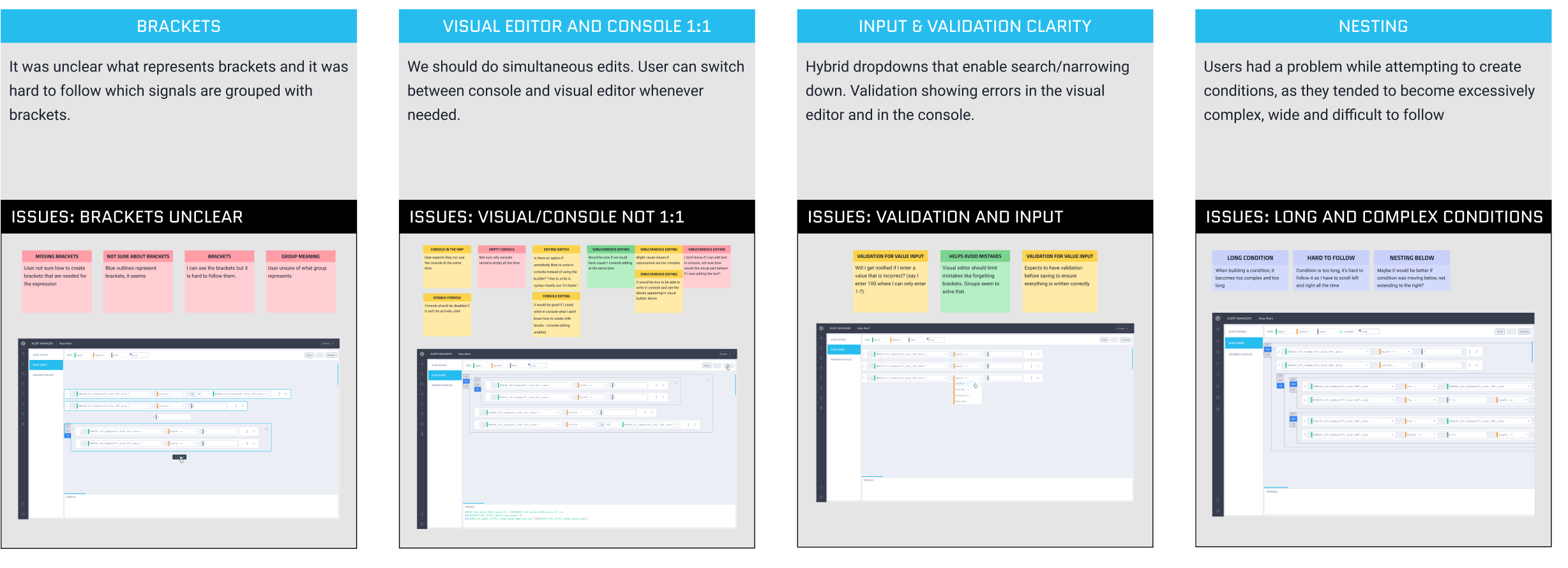
Figure 1 shows insights and conclusions from the usability testing, highlighting the four major problems that consistently appeared across all participants.
Usability Testing Insights
The usability testing results revealed several key issues:
Brackets unclear
The representation of brackets was unclear.
Long and complex conditions
Users encountered difficulties when creating conditions, as they often became excessively complex, wide, and difficult to follow.
Editor/Console 1:1
The ability to build and monitor conditions simultaneously within the console was identified as an important requirement for users.
Validation and input
Validation is crucial to ensure that user-defined conditions are error-free and well-structured, supporting the accuracy and reliability of their inputs.
These insights gave us a clear, evidence-based list of design problems to solve and helped us prioritize improvements based on user value and implementation effort.
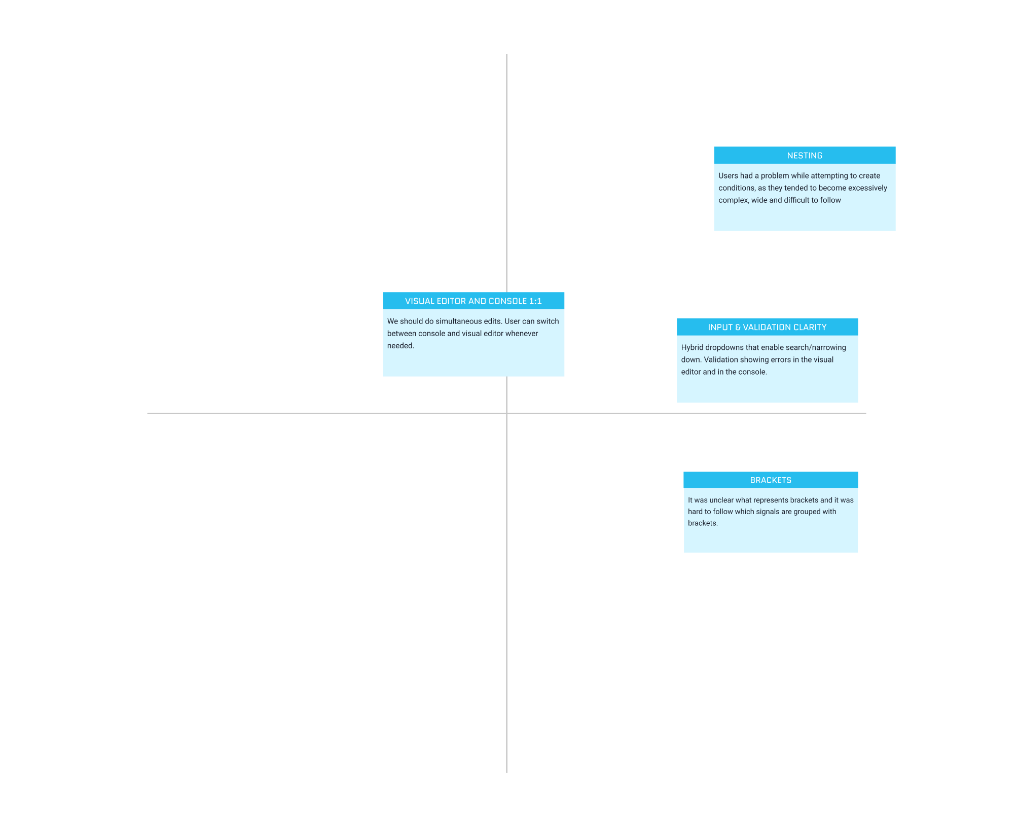
Figure 2 shows the Value–Effort Matrix used to prioritize issues by impact and effort, helping us focus on changes that delivered the most value with the least complexity.
- Clarifying the Use of Brackets
The initial representation of brackets was unclear. Users did not immediately understand that the lines around conditions represented brackets or how grouping worked.
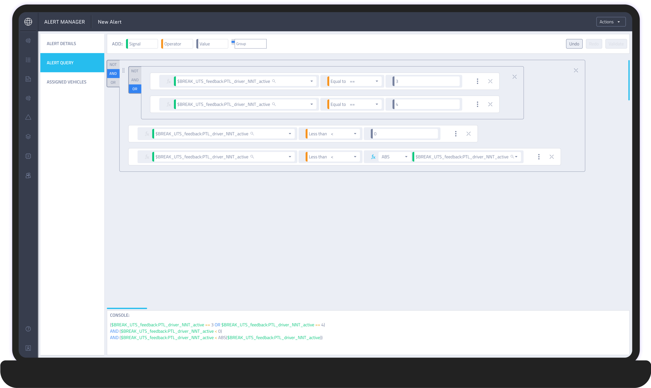
Figure 3 shows the initial design, where lines around the conditions were used to represent brackets.
Solution
We introduced explicit “Open Bracket” and “Close Bracket” actions instead of relying on subtle visual indicators. This made grouping intentional and visible, allowing users to clearly control the logical structure of their conditions.
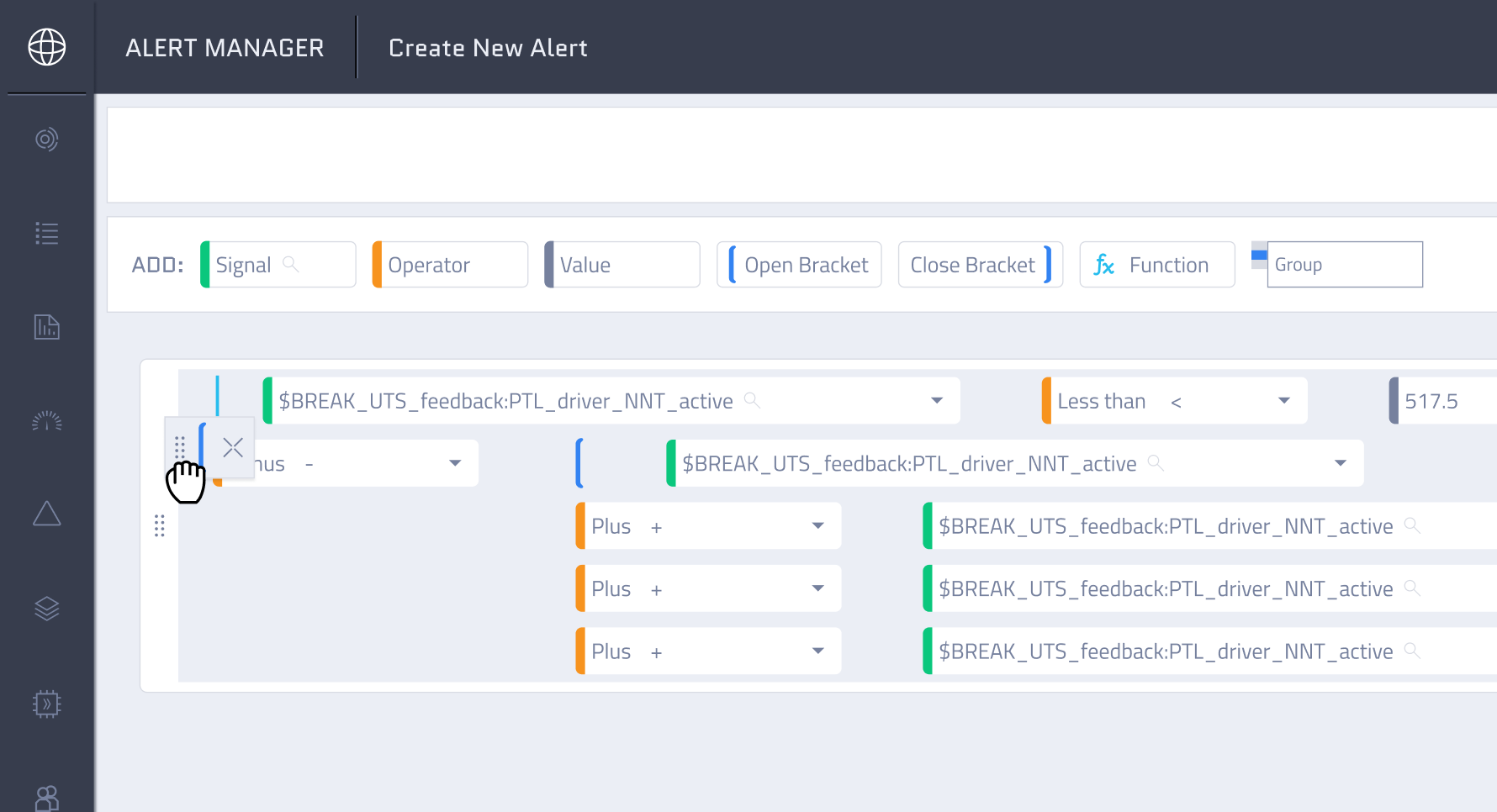
Figure 4 shows open and close bracket buttons that allow users to freely group conditions.
- Making Complex Conditions Easier to Follow
While creating conditions, users often ended up with structures that were overly complex, wide, and difficult to read.
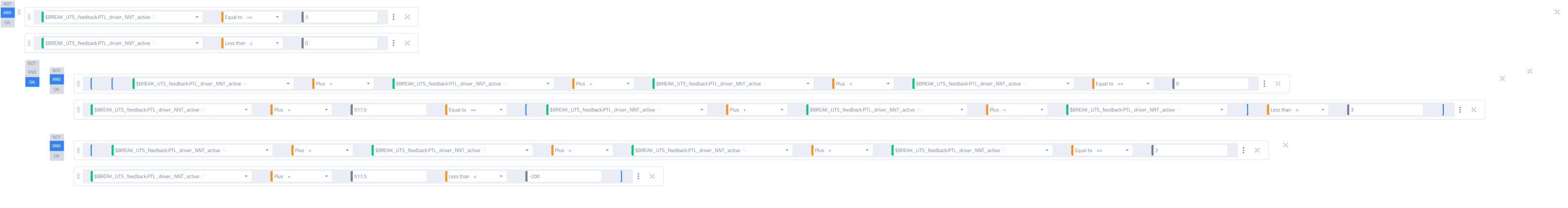
Figure 5 shows wide and complex conditions in the initial prototype.
Solution
We redesigned the layout so arithmetic and logical operations are visually separated into rows. This introduced a clearer hierarchy and reduced horizontal stretching - which lowered cognitive load and made complex logic easier to scan and understand.
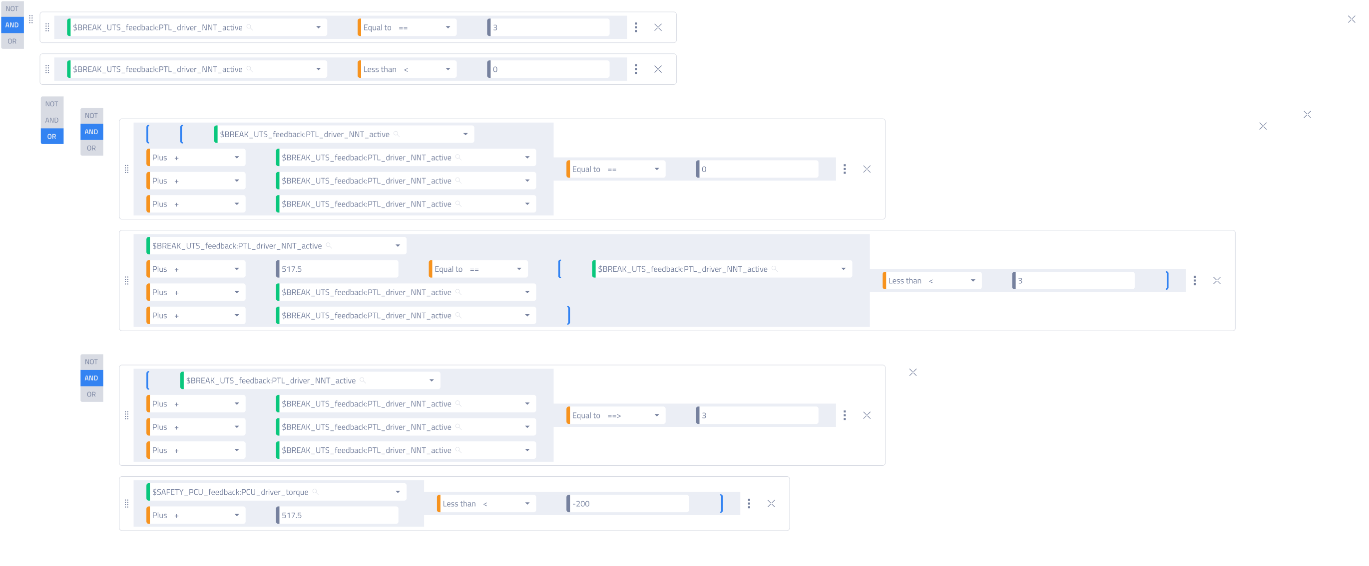
Figure 6 shows a redesigned, row-based condition layout that improves clarity and readability.
- Validation as a Core Part of the Experience
Validation was crucial to ensure conditions were error-free and correctly written, but users lacked confidence that their inputs were valid.
Solution
We added real-time validation that detects incorrect patterns (such as misplaced operators or brackets) and provides immediate feedback which reassures users that the system is guiding them toward correct input.
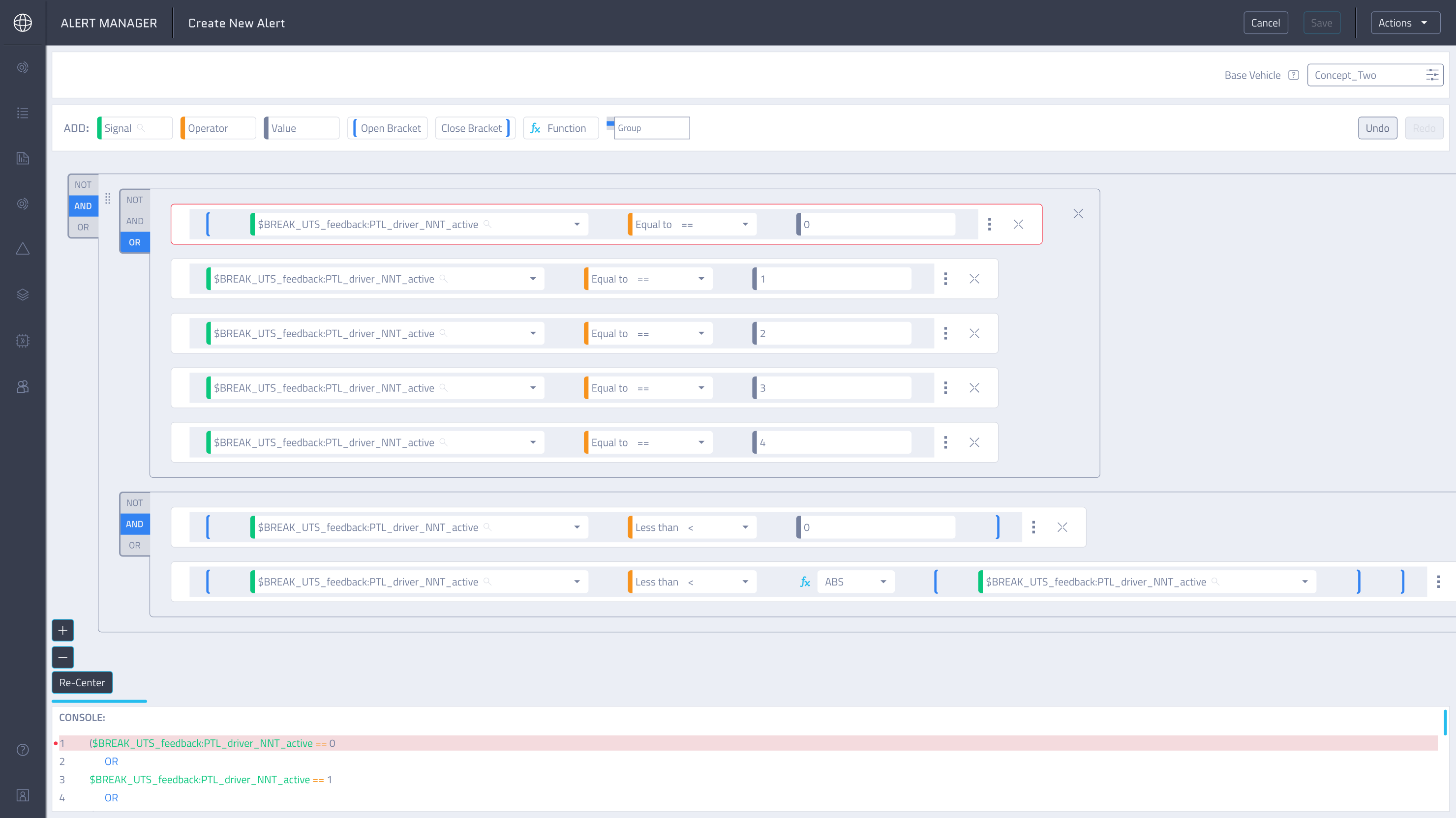
Figure 7 shows how errors are surfaced both in the editor and the console, helping users quickly identify where the issue is and fix it more easily.
- Visual Editor and Console Work Simultaneously
Users needed a way to simultaneously build conditions and understand how they translate into the console output.
Solution
We aligned the builder and console so they update in parallel. Additional visual aids, such as indentation and row numbers, helped users map each condition to its console representation. This created a strong mental connection between what users build and what the system executes, increasing trust and transparency.
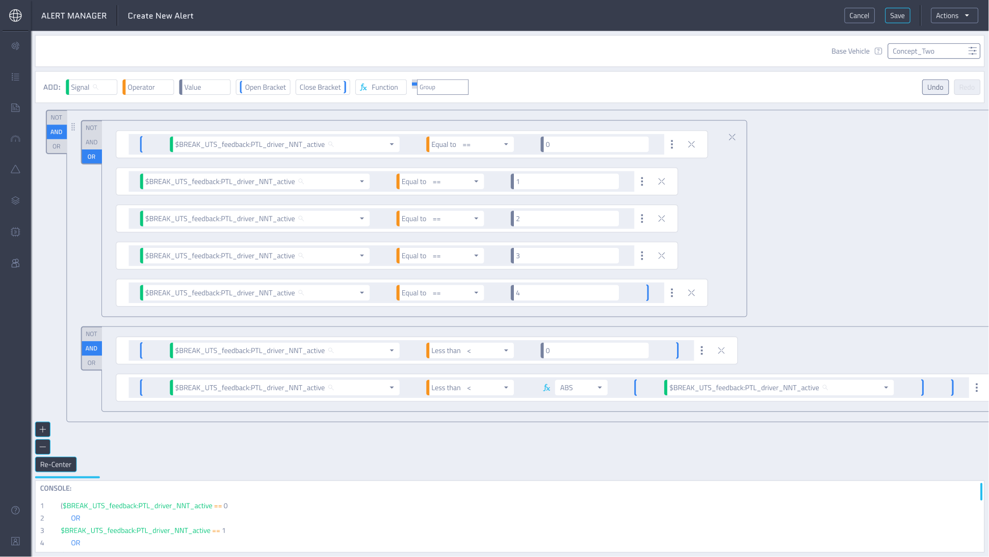
Figure 8 shows how changes made in the editor are instantly reflected in the console, allowing users to work with either view interchangeably.
Results & Impact
These changes transformed the condition-building experience into a clearer, more predictable workflow. Users could create, validate, and understand complex logic with confidence, while the system actively supported them in avoiding errors.
Lessons & Takeaways
- This project showed me that:
- Complex systems don’t require complex interfaces: Thoughtful structure and clear patterns make even advanced functionality easy to use.
- Iteration and usability testing are essential: Regular feedback loops helped us validate decisions and refine solutions early.
- System-level thinking matters: Designing with the full product ecosystem in mind prevented downstream issues and supported long-term scalability.
Jump To Next Project
