NativeWaves • June 2024
From 200+ Design Tokens to a Scalable Theming System
Every broadcaster wanted NativeWaves EXP to feel like their product — with their own colors, typography, and visual identity. While we already had a design token system in place, it had grown overly complex and difficult to maintain. As a Focus Group Lead and Product Designer, I helped lead a redesign that simplified the system while making theming faster, clearer, and more scalable.
What Wasn’t Working
Over time, the token system had expanded to more than 200 tokens, many of which overlapped, were rarely used, or were tied too closely to specific components. This made customization slow, error-prone, and hard to reason about — both for designers and engineers. Instead of enabling flexibility, the system was becoming a blocker.
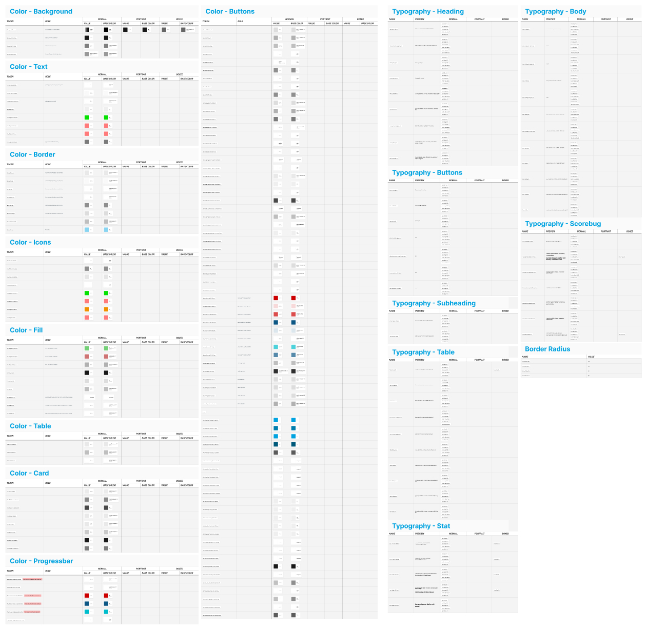
Figure 1 shows the old design tokens.
Objectives
The goal was to enable flexible customization of UI elements, like colors, typography, and border radius, so the app could easily match a customer’s branding. The aim wasn’t to allow every tiny detail to be customized, but to focus on the elements customers most often want to change and reflect their brand.
My Roles & Responsibilities
As Focus Group Lead, I took responsibility for guiding the whole process - from organizing and running workshops, to mentoring junior designer through the process, managing deadlines, and keeping design, engineering, and management aligned.
My role was both creative and managerial: defining which elements truly mattered for customization, prototyping them in Figma, and ensuring that decisions turned into clean, documented rules.
How We Approached the Problem
We started by reviewing real customer requests and identifying which UI elements were most frequently customized. Once identified, we grouped these elements logically and reduced them to a small set of semantic tokens.
For example, instead of assigning a primary color to dozens of elements individually, we introduced a single “highlight” token. Changing that one value instantly updated all related UI elements for a new customer brand.
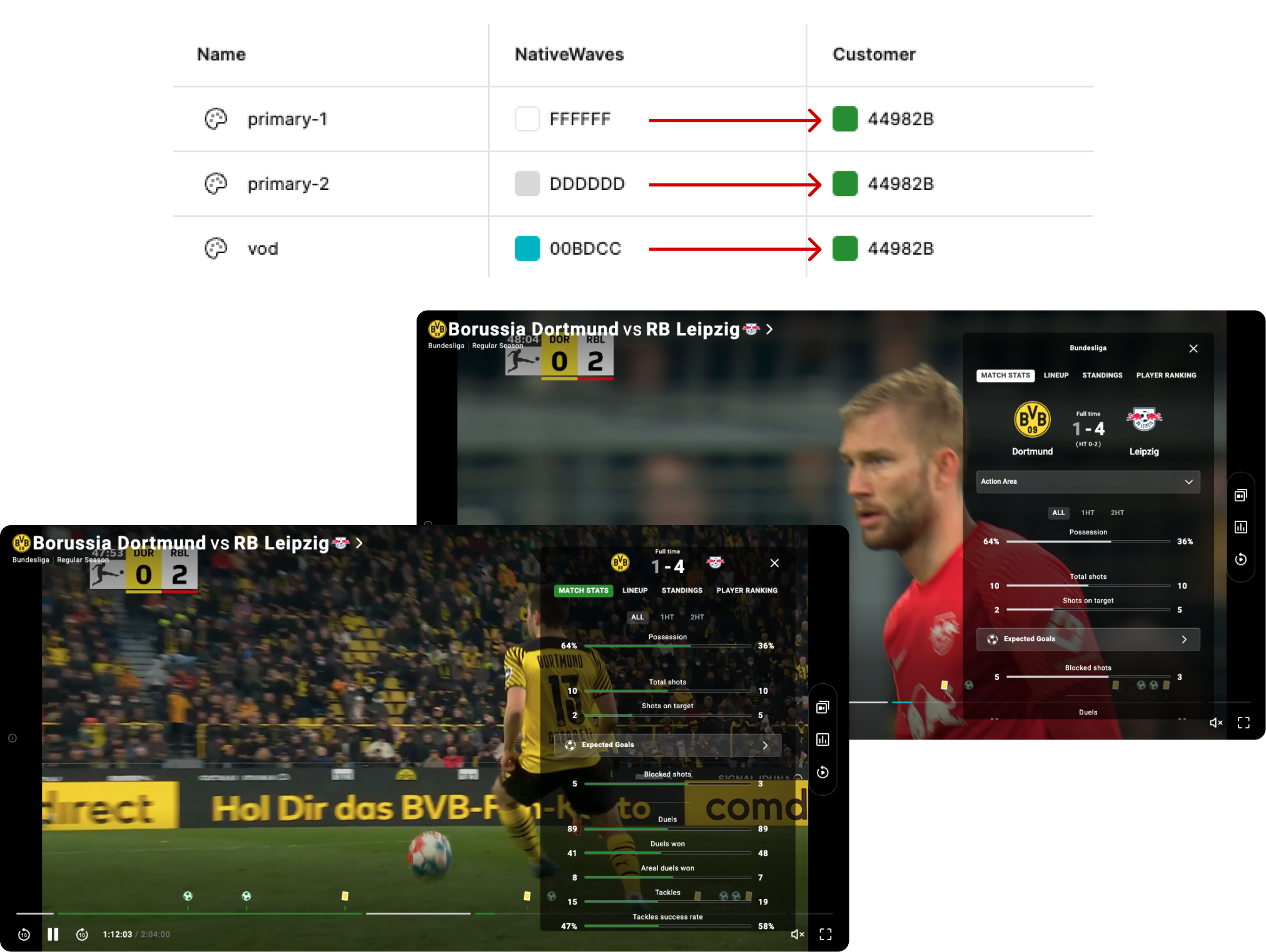
Figure 2 shows how changing the values of just three tokens results in a customized interface using the customer’s primary color.
Typography required a separate decision. Since many customers use different fonts for headings and body text, we created distinct tokens for each, allowing full control with minimal complexity.
Constraints & Trade-offs
During the redesign, we had to make several foundational decisions: whether to use semantic or component-specific tokens, how to handle interaction states like hover and pressed, and how to document the system, so it stayed easy to understand and maintain.
Through iterative prototyping and close collaboration engineering, we made intentional trade-offs:
- We decided on using semantic tokens as the foundation, as they offered greater flexibility and scalability across the product.
- We deliberately avoided creating separate tokens for hover, focus, and pressed states unless truly necessary, keeping the system lean and reducing complexity.
- To ensure clarity and long-term usability, all tokens were documented in a shared, central space with clear naming, values, and references to where they’re used.
This allowed the team to quickly understand the system and update it with confidence.
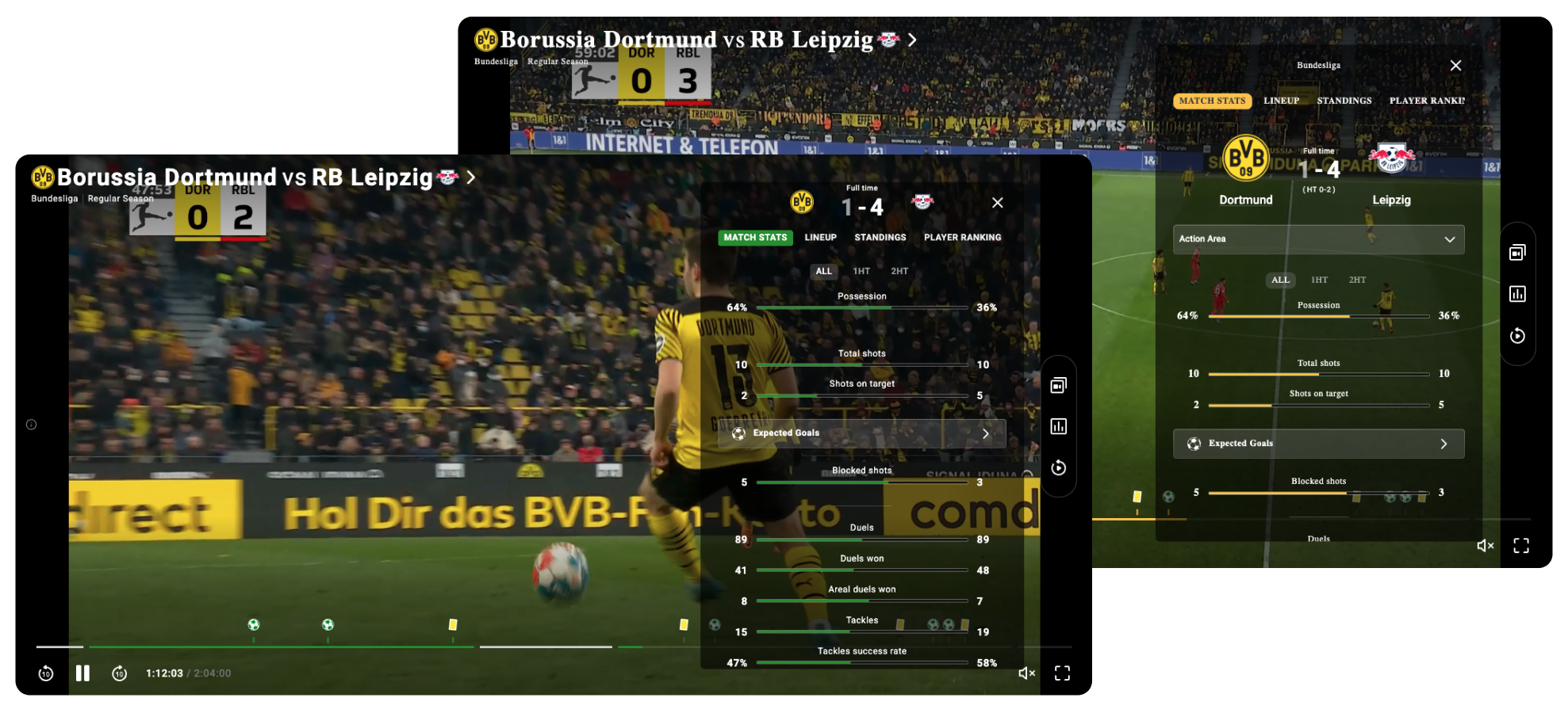
Figure 3 shows how colour and typography tokens can be adjusted to reflect a customer’s brand colours and font family.
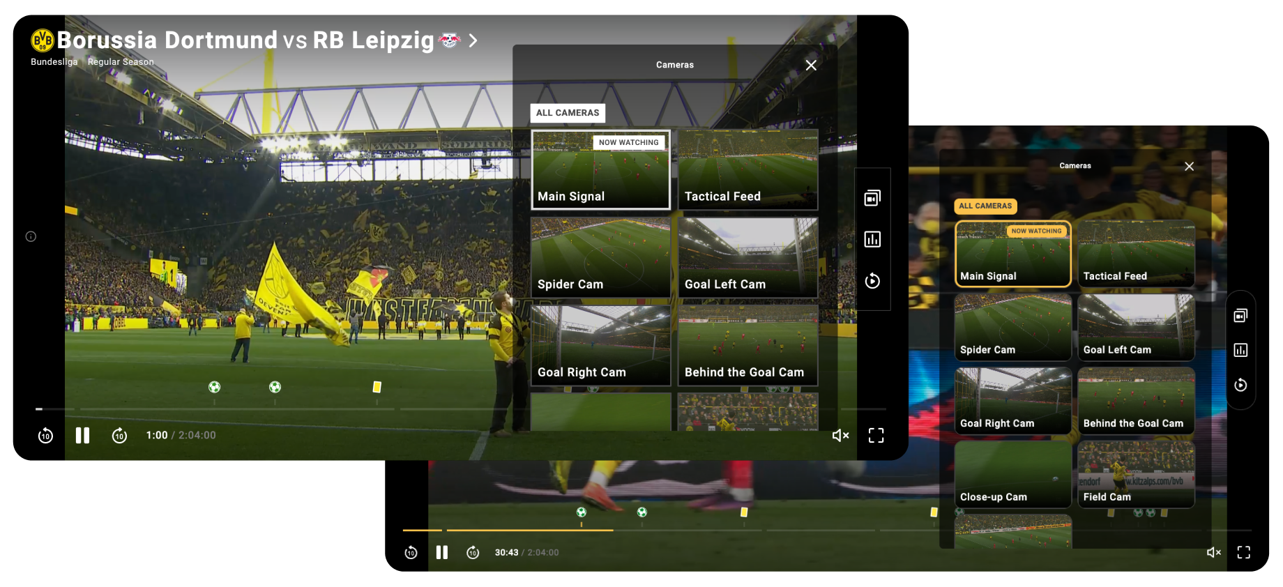
Figure 4 shows how border radius customization is applied, allowing us to shape components in line with the customer’s brand look and feel.
Results & Impact
The redesigned token system became significantly leaner, easier to maintain, and faster to use. What previously took days of manual adjustment could now be done in a few hours by changing a handful of values. Branding became more consistent, collaboration between design and engineering improved, and customers received faster, more reliable theming that truly reflected their identity.
Lessons & Takeaways
This project taught me several important lessons:
- Less is more: A smaller, well-structured system is more effective and maintainable than an overly complex one, especially in a product like NativeWaves.
- Leadership is part of design: Guiding discussions, aligning teams, and keeping momentum proved just as important as the visual or technical output.
- Structure enables scalability: With the right balance of structure and collaboration, even complex systems can become simple, scalable, and future-proof.
Read more about this work in my tech blog post
See NativeWaves Blog
Jump To Next Project
