Space Inch • August 2023
MediCare Redesign: Turning Complex Healthcare Operations into Clear Workflows
MediCare is a platform built to help healthcare agencies manage clients, employees, compliance, scheduling, payroll and billing in one place.
Before our redesign, the software was very outdated, filled with unused modules and excessive input fields, and required both a visual and UX redesign to modernize it and make it easier to use. Workflows were fragmented, repetitive, and difficult to navigate. Simple actions like creating a new client or updating an employee’s compliance record required multiple screens, manual data entry, and frequent cross-checking between departments.
My Roles & Responsibilities
As a UX Designer, working closely with the PM and another UX designer, I focused on identifying the biggest usability and workflow issues across all core modules. I contributed to solution ideation, wireframes, interactive prototypes, and detailed design handoffs, always considering dependencies between modules.
In parallel, I led the creation of a shared design system to ensure consistency, scalability, and clarity across forms, modals, and interaction patterns.
Client Management
Client Management module centralises all information and processes related to managing clients receiving home care services, streamlining operations, improving communication, and enhancing the quality of care delivered.
The problem
Managing client records was one of the most frequent yet most confusing tasks. The interface was cluttered and inconsistent, with unclear field labels and excessive scrolling. Users didn’t understand what certain fields meant (for example, Address Label or the Active email checkbox), nor how their inputs affected billing, scheduling, or compliance. There was also no way to quickly see key client information at a glance, leading to errors, missing data, and daily frustration during onboarding.
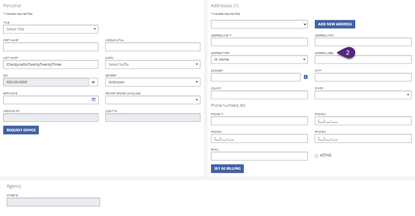
Figure 1 shows the legacy client management UI, which was cluttered, lacked clear hierarchy, and used unclear field labels, making the form difficult to scan and understand.*Image quality may be lower as this is a screenshot.
The process
We started by mapping the existing flow and identifying where users hesitated or made mistakes. Through collaborative sketching and iteration, we explored ways to simplify data entry while keeping critical information accessible. Continuous feedback loops with the PM and stakeholders helped clarify what each department needed and where confusion most often occurred. This iterative approach led us to a guided, step-by-step modal structure.
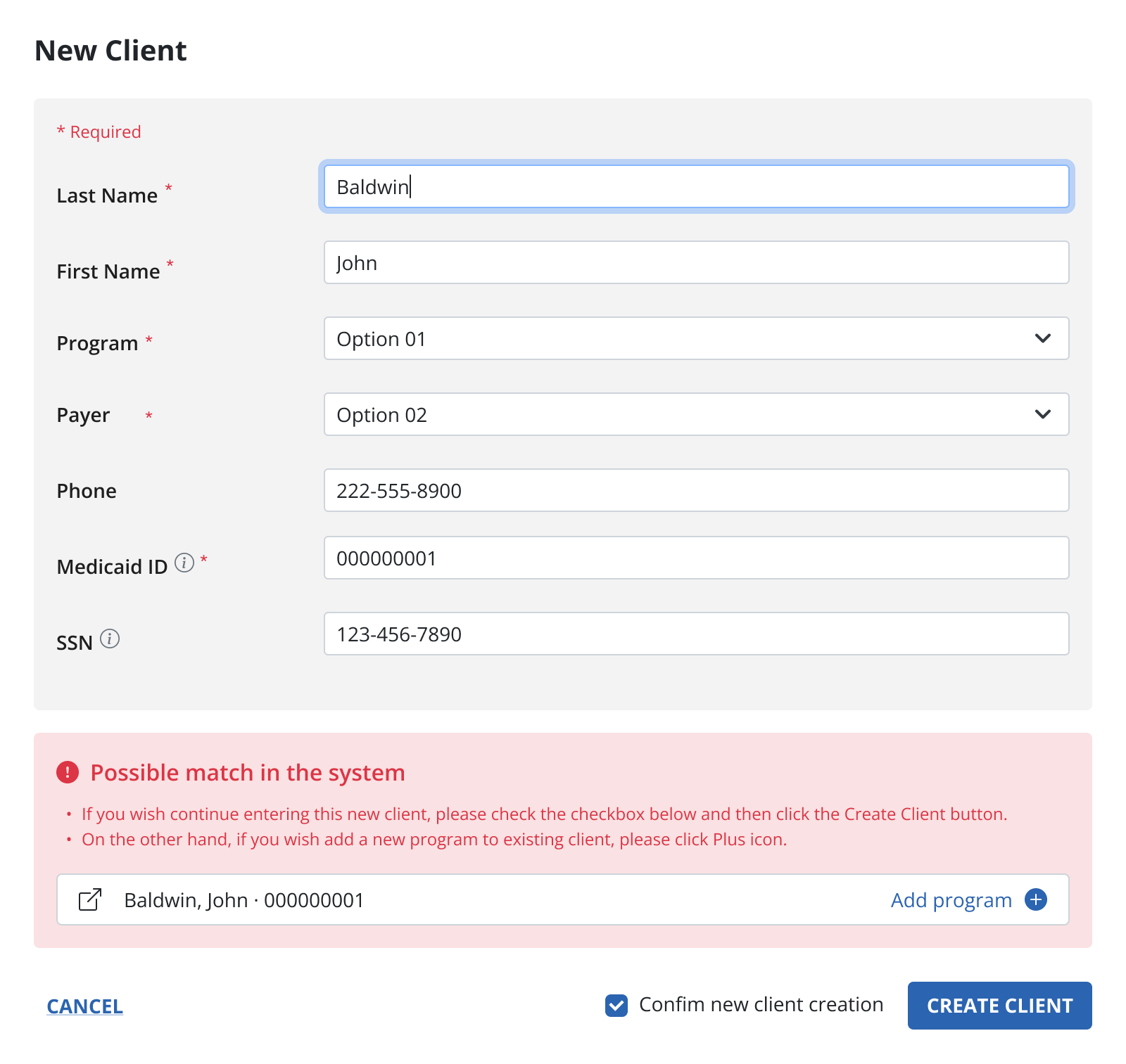
Figure 2 shows the initial design draft, which was discarded because it didn’t support all required fields and didn’t meet the desired level of visual modernity.
The solution
We redesigned client creation as a four-step guided flow:
- Personal Information for identification and compliance
- Phone Numbers for reliable communication
- Address with clear main and billing options
- Contacts for emergency and family coordination
Breaking the flow into logical steps reduced cognitive load, improved data accuracy, and made onboarding faster and more predictable.
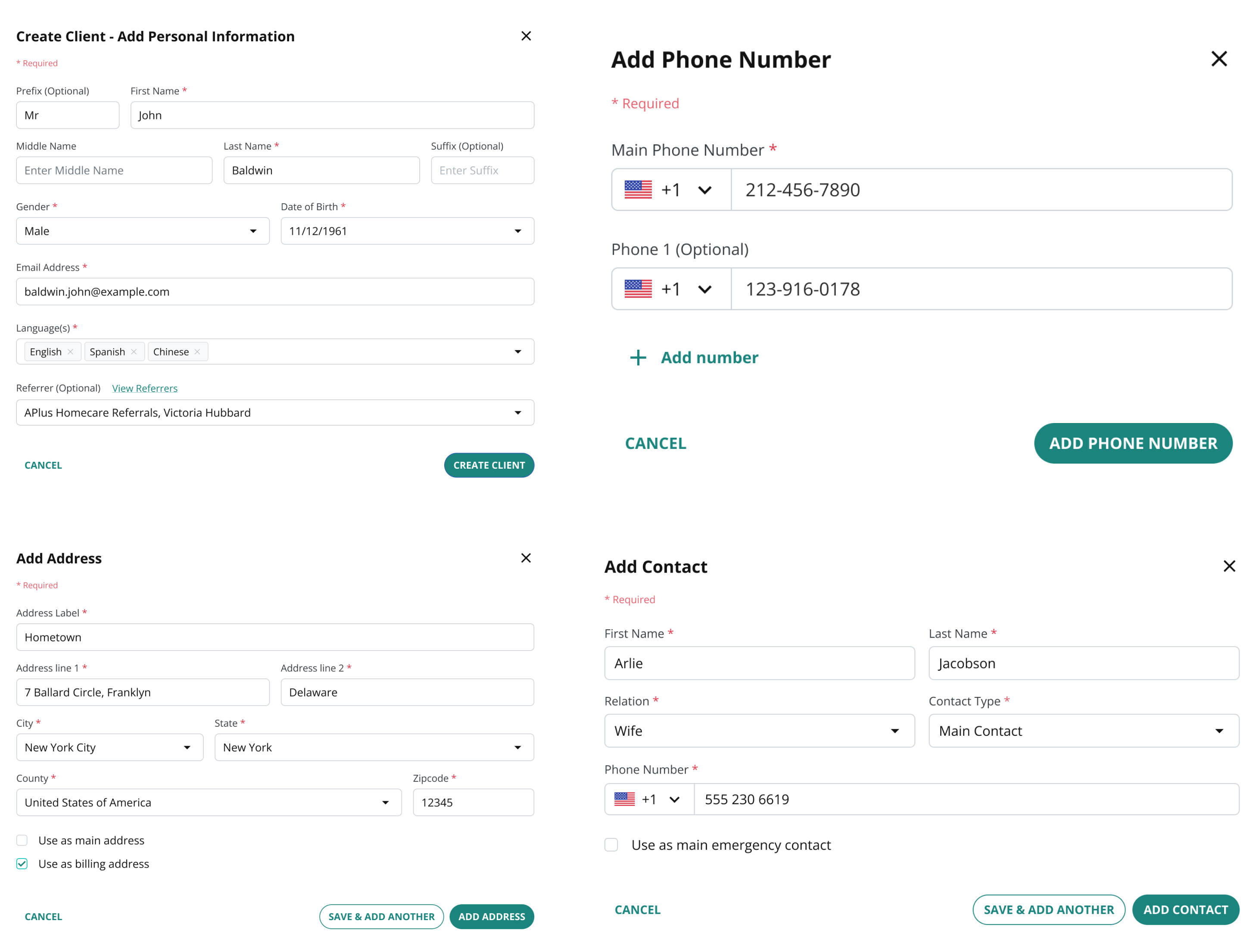
Figure 3 shows final Client creating flow in multiple steps
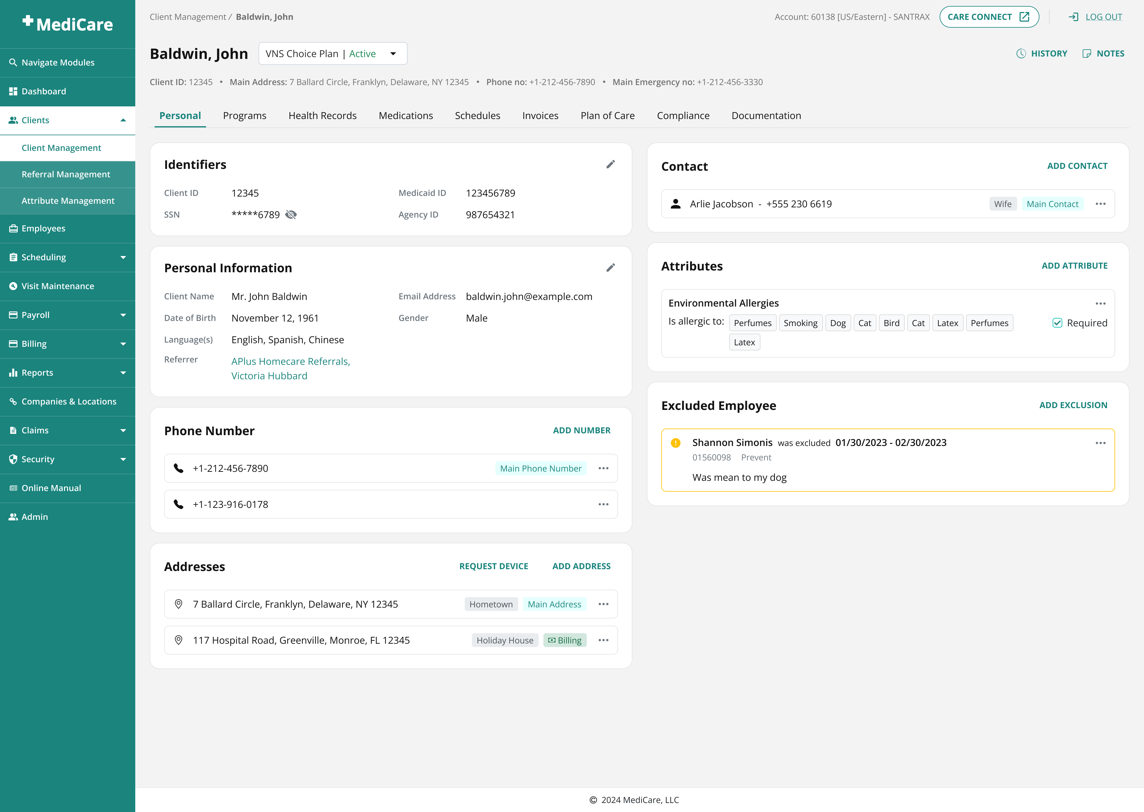
Figure 4 shows a Client Profile page that provides a structured overview of a client’s personal details, care-related attributes, and much more.
Scheduling
Scheduling module enables home care agencies to schedule home visits and appointments for clients based on their care needs and preferences. It provides tools for assigning Employees to Clients and managing visit schedules.
The problem
The scheduling flow was chaotic and error-prone. Fields were scattered, labels unclear, and users had to scroll constantly to validate their inputs. Timezones were shown as read-only text, leading to visits saved in the wrong time. Conflict handling was limited to warnings, with no clear way to resolve issues like double bookings or unavailable employees.
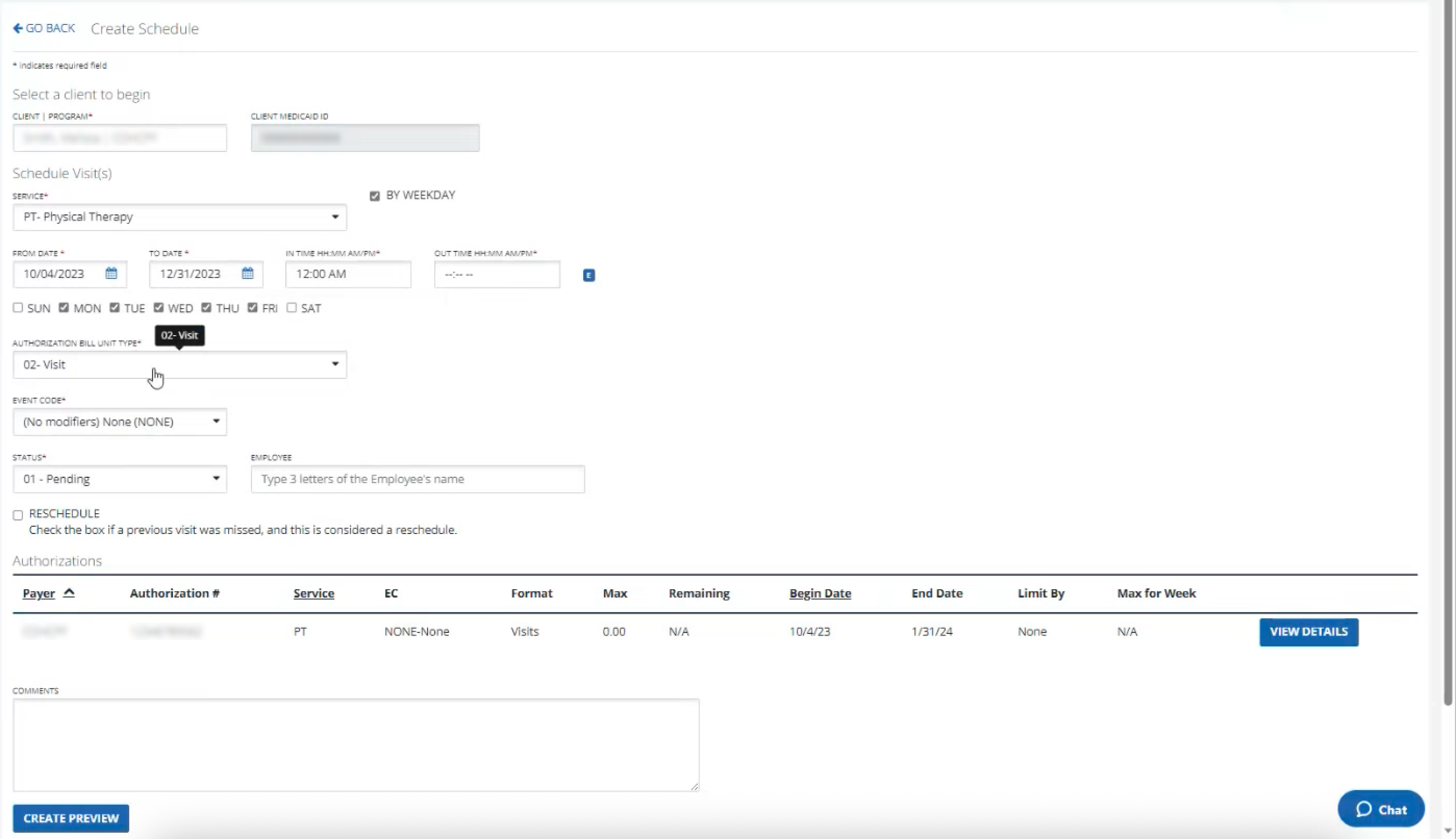
Figure 5 shows old scheduling process.
*Image quality may be lower as this is a screenshot.
The process
We restructured the layout by grouping related inputs and turning unused space into a live schedule preview, allowing users to validate their setup without scrolling. Timezones were redesigned as editable dropdowns with smart defaults. Conflict resolution required deeper exploration: early concepts either overwhelmed users or didn’t support variable visit lengths. Through multiple iterations and testing, we moved toward a visual, in-context solution.
Video 1 shows a final prototype of scheduling creation - Client and Employee selection
Video 2 shows a final prototype of scheduling creation - Date & Time selection
Another major challenge was conflict resolution, which turned out to be the most complex part of the process, mainly because the old design had no real conflict resolution flow at all. Early concepts focused on simple warnings or long lists of available time slots, but both approaches failed in practice: warnings didn’t help users take action, and slot lists quickly became overwhelming while also ignoring variable session lengths (for example, visits lasting 1 hour and 15 minutes).
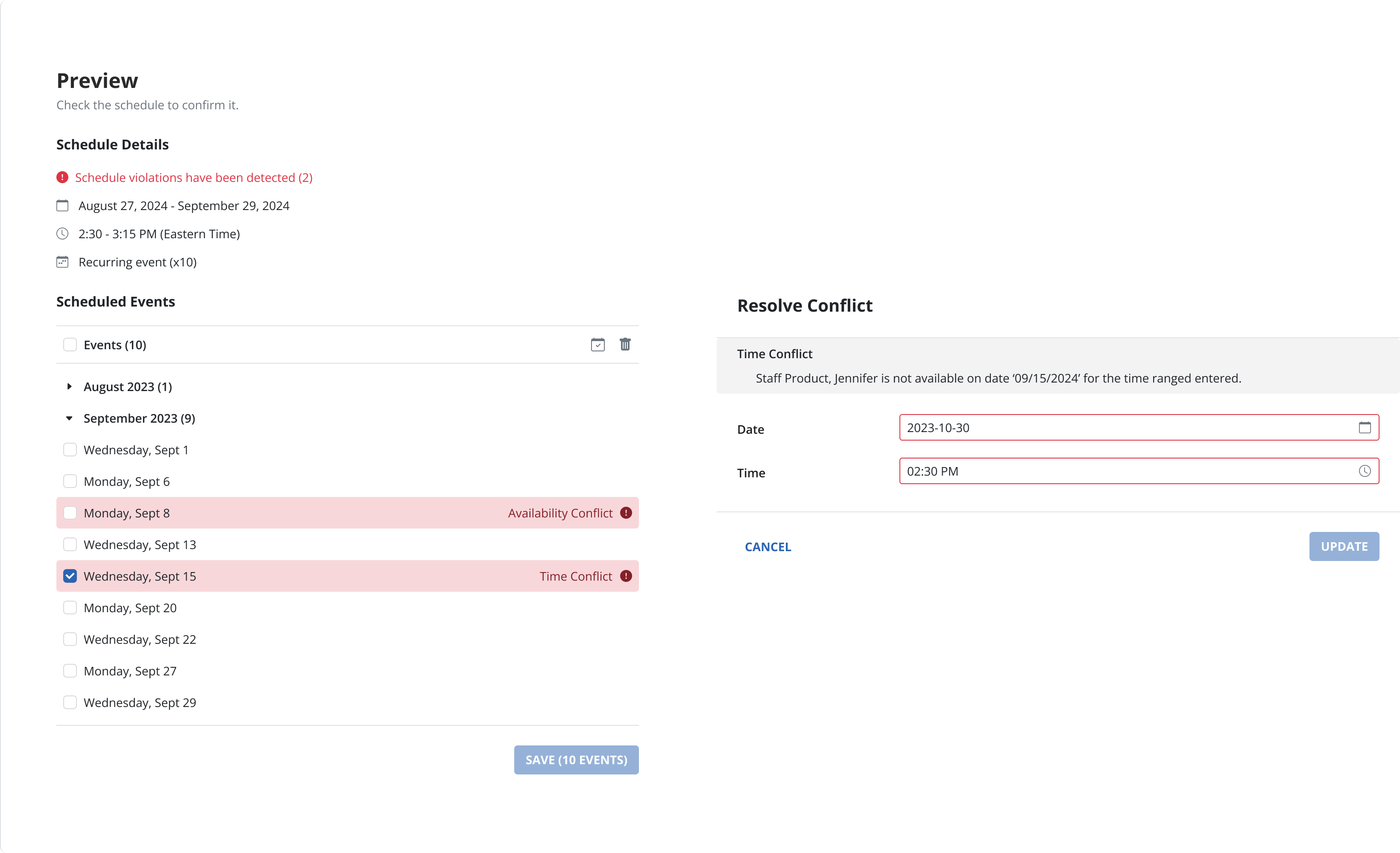
Figure 6 shows the first conflict resolution design draft, which clearly communicated that a conflict existed but did not guide the user on how to resolve it.
Through multiple iterations and discussions, we shifted toward a more interactive and visual solution. We introduced contextual conflict chips that clearly explained the issue (such as an availability conflict) and allowed users to resolve it directly. Clicking a chip opened a modal with a timeline view, where users could immediately see overlaps and select a valid new time or date. Each iteration focused on keeping users in their flow and making the next action obvious. This approach ultimately proved the most intuitive and flexible, successfully handling both simple conflicts and more complex edge cases like overlapping durations or last-minute employee unavailability.
Video 3 shows a final prototype of scheduling creation - Conflict resolution
Results & Impact
The redesign transformed MediCare into a clearer, more reliable system. Client onboarding became faster and more accurate, scheduling errors dropped significantly, and users gained confidence through early validation and visual previews. Shared components and rules across modules reduced cognitive load and made the product feel cohesive rather than fragmented.
Lessons & Takeaways
This project reinforced that:
- Clarity at every input reduces errors: Explaining why data matters, validating early, and previewing outcomes prevents downstream issues.
- Context builds confidence: Users make better decisions when they understand how their input affects the system.
- Collaboration is critical: Close work with engineering and stakeholders ensured designs were feasible, accurately implemented, and aligned with real operational needs.
Jump To Next Project
