NativeWaves • November 2024
Redesigning Audio Sync Feature for Seamless Multi-Device Viewing
While watching a match on a TV, sports fans use their mobile as a second screen for stats, highlights, or alternate camera angles - but latency between devices often creates a disconnected experience. Audio Sync feature solves this, yet it lacked clarity in critical moments.
The Challenge
An internal UX audit revealed that the existing Audio Sync experience caused uncertainty and frustration. The flow gave users no clear indication of whether they were synced, how to unsync, or what would happen when they rewound the timeline. Failed sync attempts offered little guidance, making the feature feel unreliable and hard to trust.
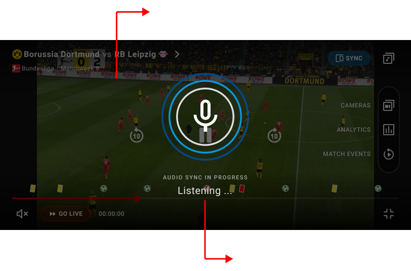
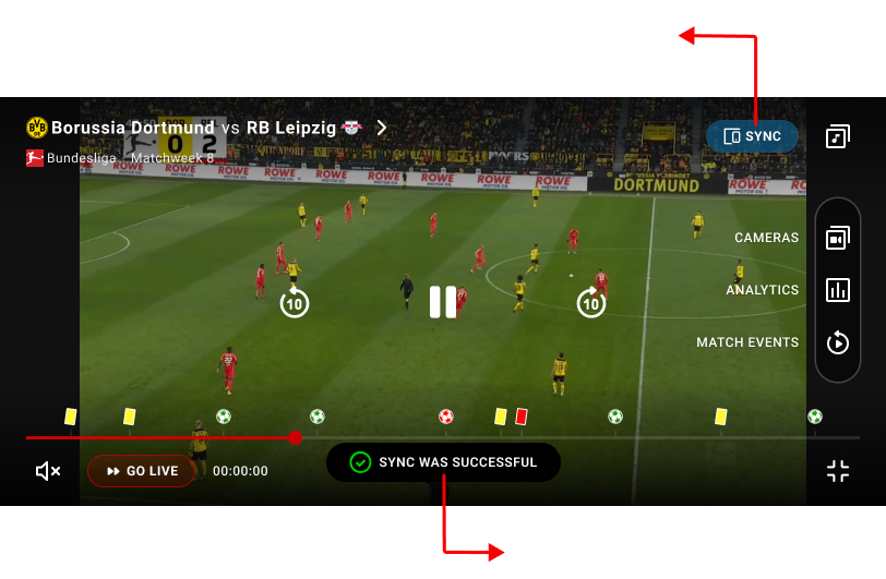
Figure 1 shows old second screen sync design and its’ flaws.
Objectives
- Make sync status immediately visible and easy to understand
- Define a clear, predictable flow for syncing, unsyncing, and rewinding
- Provide helpful feedback when syncing fails, so users know how to recover
My Roles & Responsibilities
As both Focus Group Lead and Product Designer, I facilitated workshops with product and engineering to identify key UX issues and align on priorities.
I redesigned the flows in Figma, created interactive prototypes, validated them with stakeholders, and delivered detailed handoffs. My focus was on clarity, trust, and cross-platform consistency.
Initial Concept & Why It Didn’t Work
Our first approach to Audio Sync placed all sync-related actions into a single overlay, aiming to give users full transparency over sync status, available devices, and controls. This early concept helped us quickly explore how syncing, unsyncing, and device selection could work within the player.
However, internal reviews and early feedback showed that the UI was too heavy and cognitively demanding. Presenting too many options at once, combined with unclear hierarchy and weak visual distinction between states, made the experience harder to understand rather than clearer.
Since this approach increased complexity instead of reducing it, we discarded it and shifted toward a simpler, state-driven solution. This led to the final design, where each sync state is clearly communicated, actions are intentional, and the experience is easy to understand at a glance.
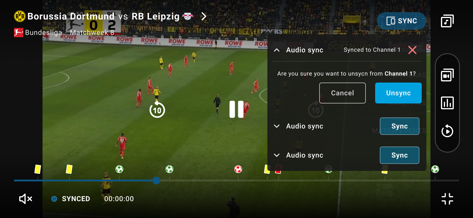
Figure 2 shows an early Audio Sync concept with all sync actions and states combined in one overlay, which made the experience feel cluttered and unclear.
Designing the Final Experience
Building on these learnings, we moved to a state-driven sync flow, communicating one clear state at a time.
- Not synced: Users see a clear “Start listening” action with short instructions, especially helpful for first-time use.
- Listening: The UI switches state immediately, reinforced by a toast message confirming the system is actively listening.
- Synced: A confirmation toast appears and the button updates to “Synced,” with a clear option to disconnect.
- Errors: Failures are explained in plain language (e.g. microphone access), and the flow resets cleanly so users know what to do next.
All states are consistently communicated through toast messages and button state changes, making the flow predictable and easy to follow. When users rewind while synced, playback stays in replay mode and a “Go Sync” button appears, giving users control without forcing behavior.
Video shows the final solution prototype. Minor UI inconsistencies (such as timestamp not changing) may be present, as this is a prototype.
This solution was shaped through continuous collaboration with engineering and the product manager, aligning on edge cases, system behavior, and technical constraints throughout.
Results & Impact
The redesigned sync flow turned a confusing feature into a reliable, intuitive experience. Each sync state was now immediately recognisable, disconnecting felt intentional, and replaying moments no longer broke the sense of control. Clear feedback and improved error handling removed friction, resulting in a consistent and trustworthy second-screen experience across platforms.
Lessons & Takeaways
This project taught me that:
- Clarity builds trust: Even technically complex features feel approachable when states are clear and feedback is meaningful.
- UX leadership goes beyond screens: Facilitating discussions, aligning teams, and guiding decisions were just as critical as designing the interface itself.
Jump To Next Project
